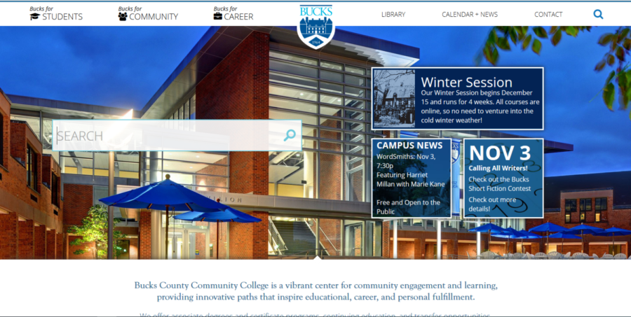
The newly-redesigned Bucks County Community College website is here with a boldly designed website offering easier access to different departments including user-friendly search tools and welcomes a change to the more antiquated looking website that has been the same for over a decade now.
“It was time for a change. The website hasn’t been changed in ten years,” said Brant Steen, Web Systems Developer, at Bucks County Community College.
“It looks more modern and is more user friendly,” he continued. “A lot of testing and research went into this.”
“Obviously not one size fits all, but I think there is a lot of flexibility with the new website,” said Steen. The reception, he said, has been mostly positive from both students and faculty members alike.
Sebastian Avila, 20, agrees. “It’s better suited. I think people will get used to it.”
“I like it. The website looks cleaner and it is now much easier to access things,” said Elizabeth Tomkins, 19.
Melissa Bray, 20, also “likes it a lot” and think it looks “cleaner and up to date”.
Alexandria Quinlan, 19, thinks the new website looks “great” but thinks it may take some time to get used to it as she was “so used to the other site”.
Despite some minor glitches here and there, there have not been any real issues and the transition has been smooth.
One of the new additions, is the large search bar at the center of the page which makes it easier to find exactly what you are looking for when browsing the website.
Unlike the previous design, the new site has larger writing which makes it easier to read and navigate.
The verdict seems to be in favor of the new website as almost all the students interviewed unanimously agreed that they like the new website. The new website brought a nice transition which adds change and color to the site. For those that haven’t been to the site, check it out!


